Behind the Brand / D'Arcy Laycock
Interview by Elly Sharp
31.03.26
Without D'Arcy Laycock, there is no RISE. At least not the way you see it today.
The Melbourne-based graphic designer has been with the brand since the beginning, shaping the visual identity from the ground up. I had the absolute privilege of asking D'Arcy about his approach to design and the building blocks beneath RISE's identity.
What drew you to graphic design and how would you describe your work?
I ask myself this question everyday haha.
My work’s always been type heavy, relying on grids. I never fancied my self as an illustrator, at school I couldn’t rely on those things. I guess also coming from a web design/tech background there was such an emphasis on structure. But over the last few years and my distane for tech, I’ve been aspiring to be more expressive - more human. I think that’s from working at Monster Children and now at Sense of Self; it’s allowed me to see other ways of doing things.
What drew me to graphic design initially was seeing Raygun magazine (online) for the first time. My little 18-year-old brain exploded. It was this super crazy textured magazine that featured artists like David Bowie and Oasis. I think at the time it was made, grunge was a huge thing. Also, not sure if Photoshop was a thing either. So there's all this texture and expression and obvious anxiousness and disregard for grids. I thought it was a cool way to express or communicate, I guess.
You used to live in Sydney and are now based in Melbourne. How has your work differed in each city?
I'm not sure if it's the city or a reflection on design, but I feel like since I moved here (2 years now) people are embracing imperfections and returning to more hand-made techniques, which I think is just exhaustion or a pushback from tech and social media. I back it, like put some personality into it. We're not perfect and that's ok.
Although it does depend on the client obviously and their needs. But I feel like even so, things are changing in that direction. All this talk about going "analog" etc… Maybe it's just my algorithm, I don't know.
Walk us through how the RISE branding came to life. Where did you start?
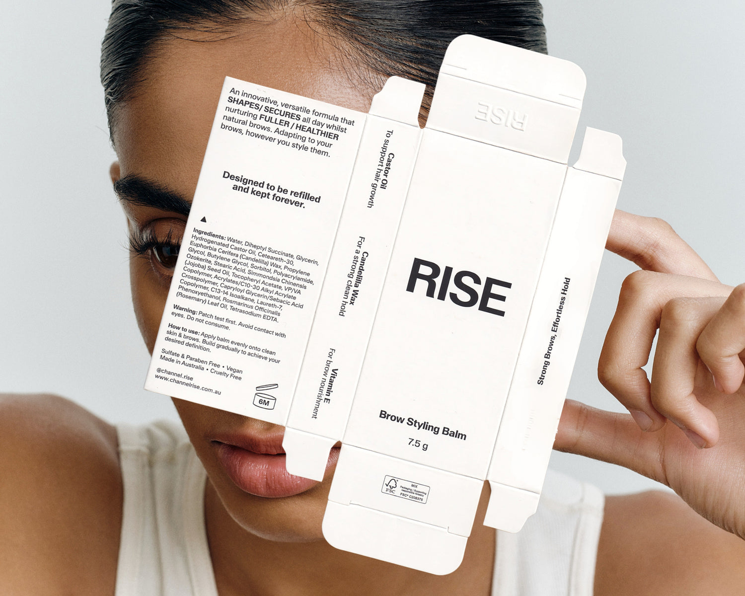
It all started when two very brave and enthusiastic people named Elly and Myles reached out to me to help take a look at the branding for their Brow Balm they were making in the kitchen.
They had a basic style guide made up already with colours pulling from the ingredients in the balm.
But from there we went on a deep-dive and had many conversations about the product, their experience in the industry, their goals and aspirations for the brand. This helped us align on a shared belief on what RISE is and stood for and then influenced all the decisions visual and non-visual from then on. It’s easy to just make things as you go when starting out, but it helps you and your customers when you know who you are as brand.
How do you approach choosing a typeface, what are you looking for?
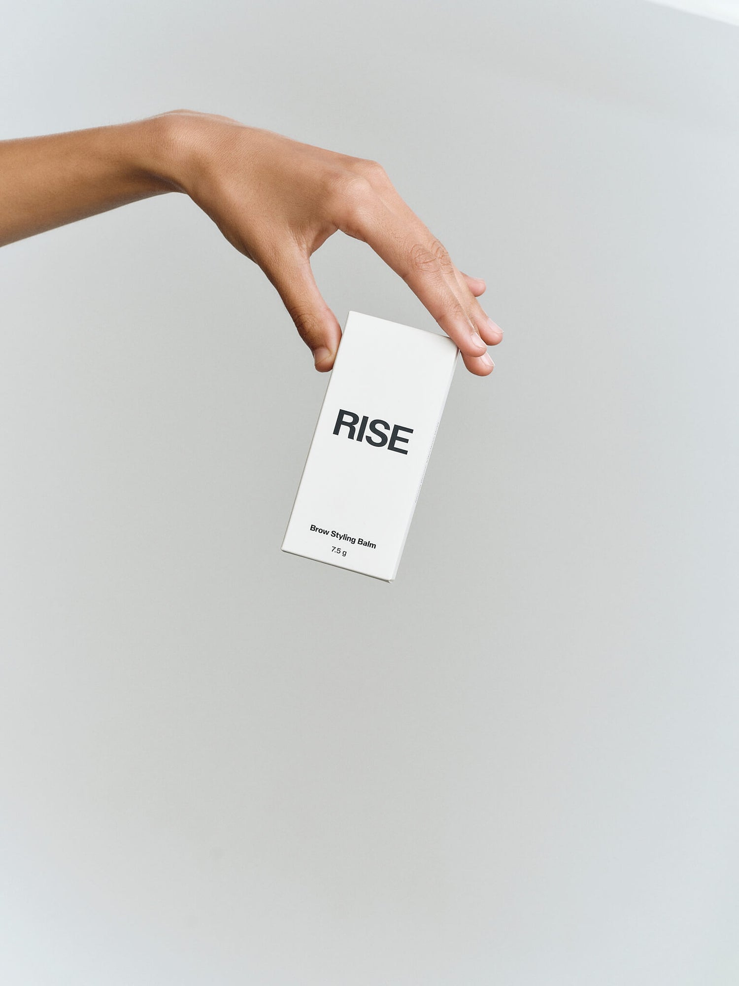
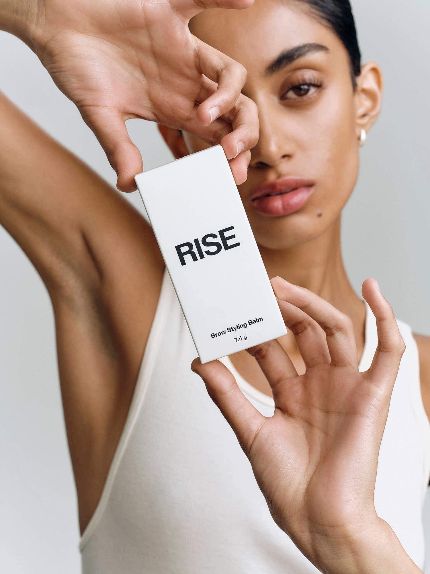
The typeface was a tricky one. I was balancing the two aspects of RISE: the interview/blog side and the product itself. Knowing that I wanted something that could live between both worlds, which is what we’re kind of seeing now. Knowing the brands history and connections to the creative industry, I knew it was going to be paired with a high calibre of work. So the typeface is minimal, but not too harsh; there’s a softness to it and paired with the dark grey, it knocks it back even more.
Also, the legibility was something that was important to us. We made sure it could be read on something small like the balm brush and have impact on something large like a street poster.
When does a project feel done to you? How do you know when to stop?
I think as a perfectionist, you can just spin your wheels over and over again. It’s something that I’ve been working on lately. Working over and over again, brings tension and fatigue. I mean, sometimes you have to push through and you find something great after that. I think keeping top of mind that as long as it hits the who, what and why you’re doing this and feels nice across multiple touchpoints. Is a nice time to stop… and reflect and start over… no, I think that’s a good indication that it’s good.
Since being in-house, I’m learning more that brands are living things.
They don’t just stop once you send the finished artwork. Things can always grow and expand. Which I appreciate and I think takes the pressure off a touch and allows the process to continue quicker. Obviously you want to do a good job still.
What's a design decision that didn't make the final cut that you still think about?
We designed this over two years ago now but like what I was saying earlier about bringing the human-touch to the brand. I think that would be cool. We were originally toying with the idea of including an abstract topology mark. Topology indicates the elevation (or rise) on mountains or hills. Which I thought could be cool. I think what we landed on is a great canvas and leaves room for exploration in the future. It also contrasts very nicely with the colour of the balm.
Favourite snack to have whilst designing?
Elly knows first-hand and maybe even enabled my addiction to boba tea’s, but these days it’s hot chai tea. I say it's because of the weather and its cozy, but it’s also inflation.
Credits:
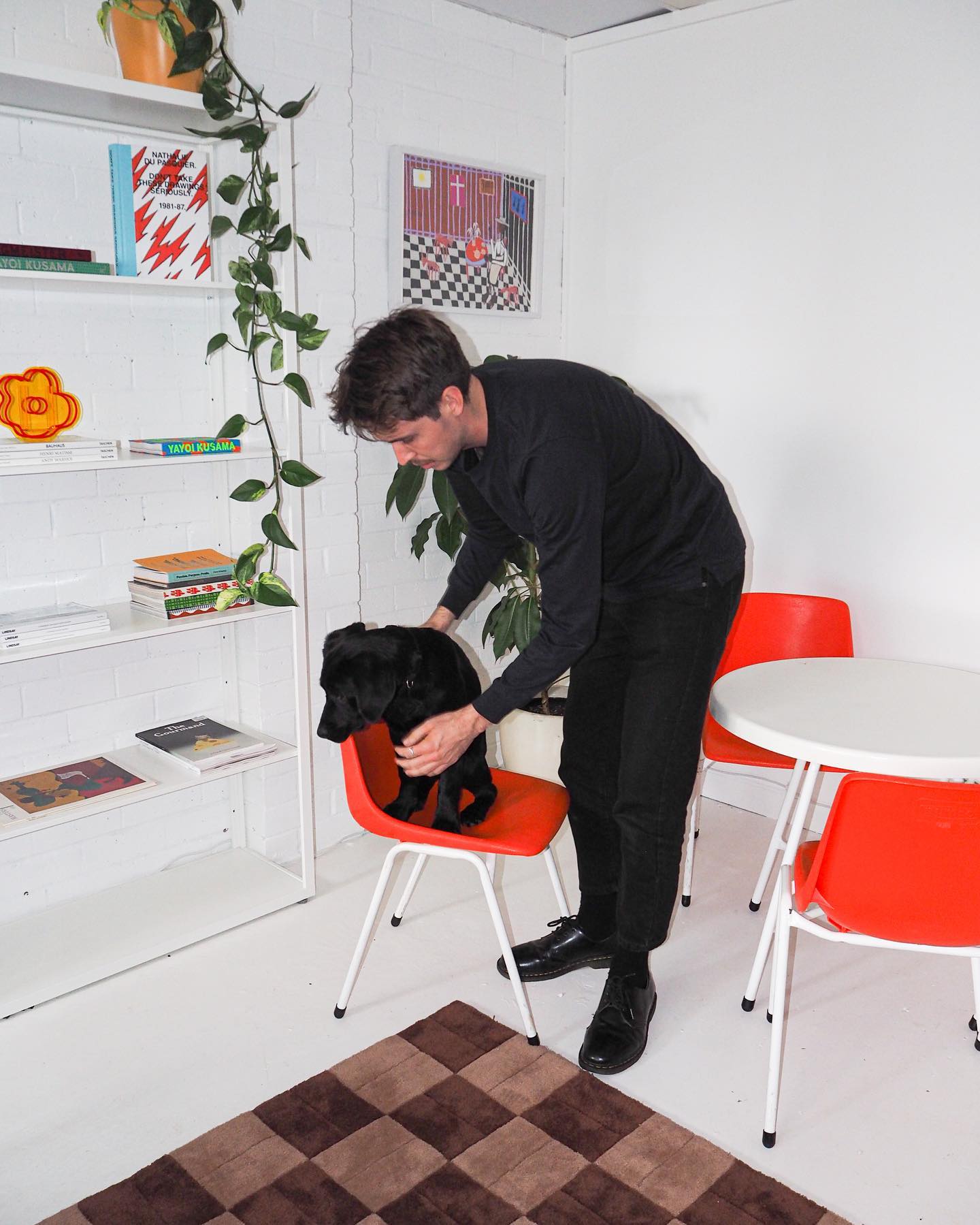
D'Arcy pictured with Jeanie


